
Future Value.
The past informs the present. The recent past, or the more distant past? What part of our past casts a long shadow over the future value of stocks?


“The past informs the present. Memory makes the map we carry, no matter how hard we try to erase it.” ― Cara Black, Murder in the Bastille
The past informs the present. Well, it sounds nice and is very quotable. But which past? The recent past, or the more distant past? A fairly learned historian and foreign policy guru Professor Hal Brands called Americans “serial amnesics.” His term stuck with me. I have long contended our education systems do not prioritize history, therefore fostering return engagements that the past, applied forward, would have suggested another course.
In the distance, I can see a train crash coming. High or hyperinflation is not good for stocks or bonds. But let’s take a short trip through the modern market consensus in search of the future value for stocks. Starting with an article out of Forbes.
How Does The Stock Market Perform When Interest Rates Rise? (Forbes.com)
According to the article, “here’s the thing about the U.S. stock market and interest rate hikes. If you try to find data showing a correlation between rising rates and falling markets, you might be disappointed.”
“Dow Jones Market Data recently analyzed the five most recent rate hike cycles to see what history says about stock market returns in these periods. Their analysis—duplicated in the chart below—illustrates that during these five long-term periods, the three leading stock market indexes only declined during one rate hike cycle.”

The Forbes authors are exactly correct in their data gathering, analysis, and subsequent causality assertion. If you consider just the last 20-plus years. I am a little older and hopefully wiser. Looking a little broader in time, to the big picture. I want to study the grand cycle on a macro scale. To do the macro work, I used the folks at OECD. The Organisation for Economic Co-operation and Development, or OECD is an intergovernmental economic organization with 38 member countries, founded in 1961 to stimulate economic progress and world trade. They have data going back to the turn of the last century. I squeezed 1954 through today on a graph. 67 years plus is represented.
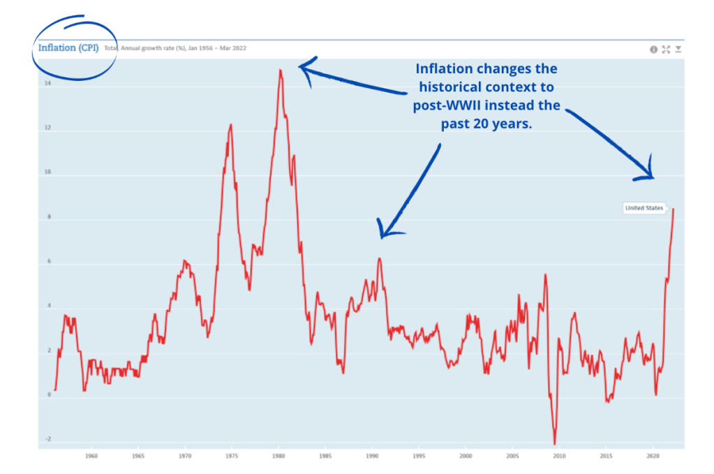
The inflation graph below is a wonderful picture of the postwar era of CPI in America. Examine the arrows I drew in several spots to point out spikes in inflation caused by energy prices. Notice the hockey stick rise in CPI for our last six months. Only the spikes in the late 1970s contend with our recent escalation.
Point #1 To those of us fixated on the last 20+ years, allow me to say, “Dorothy, we are not in Kansas anymore.” There is a bubbling cauldron of democratic contempt in Ukraine where a nuclear superpower and a major energy producer to Western Europe is playing roulette with freedom and human lives. The reboot of Soviet autocracy is running amok. Not a good sign.
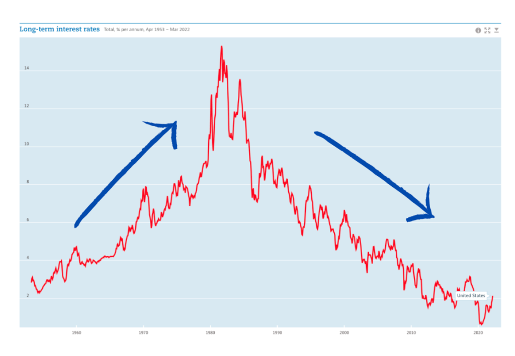
Point #2 (Long-term Interest Rate Graph – below) Interest rates have been suppressed by the G10 central banks for far too long. Please note, that we are just off the 40-year lows in interest rates.
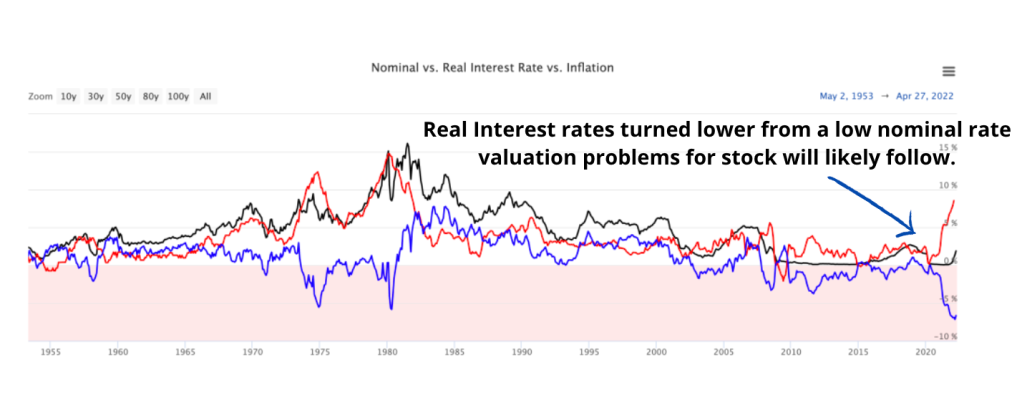
Point #3 As a consequence of cyclically low interest rates, the recent burst of inflation sent real interest rates through the floor. A negative 7%, represents a 70-year low in real interest rates as indicated on the graph below. Real interest rates are the nominal rate of interest charged by a lender minus the inflation rate, or the rate at which money is being devalued on a buying power basis. In the graph below, inflation is the red line climbing toward the sky. The black line in the middle is the nominal rate of interest and the blue line is the real interest rate.
The extremely low interest rate environment experienced over the last decade has drawn the attention of economists at the BIS. The Bank for International Settlements or BIS was established in 1930. It is the oldest international financial institution in the world. From its inception to the present day, the BIS has played a number of key roles in the global economy, from settling reparation payments imposed on Germany following the First World War, to serving central banks in their pursuit of monetary and financial stability.
The BIS staff questioned the persistence of extremely low interest rates in a report entitled “Why so low for so long? A long-term view of real interest rates” made public in December 2017. They concluded “we find evidence that persistent shifts in real interest rates coincide with changes in monetary regimes. Moreover, external influences on countries’ real interest rates appear to reflect idiosyncratic variations in interest rates of countries that dominate global monetary and financial conditions rather than common movements in global saving and investment. All this points to an underrated role of monetary policy in determining real interest rates over long horizons.”
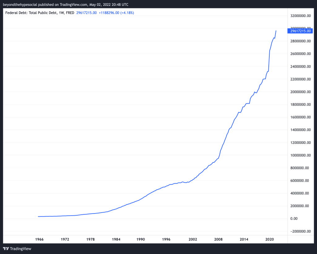
The simple translation of the BIS finding is that the Federal Reserve of the United States has suppressed interest rates. But why? The chart below explains the extremely low interest rates as a function of the US government borrowing truckloads of money. Point #4 As borrowing rates were suppressed, the US government borrowed cheap money on an epic scale. This process is often referred to as fiscal stimulus. Total public debt is charted below from 1966 forward to today.
Point #5 The result was a sea of money running away from zero or low “real” interest rates into riskier stocks like a stampeding herd.

Not only did the sea of fiscal stimulus press stocks ever higher, but the price-earnings ratios which is a traditional measure of stock valuation also soared. Please note the Shiller PE Ratio valuation measure had stocks selling at around 8 times their earnings in 1980 versus 38 times as of today. Point #6 Stocks are very overvalued by traditional measures precisely because real and nominal interest rates are so suppressed by the Federal Reserve. But that is about to change as the Federal Reserve has announced a series of interest rate rises over the next months.

Also, it is worth noting that the average lifespan of an S&P 500 index company has been cut in half over the last 60 years from 32 years to around 17. The pressure to grow earnings and innovate is taking its toll on our strongest companies.

Point #7 Given the demographic winter experienced in the United States and the west, including China over the last 65 years, who is going to pay for the skyrocketing debt or the interest on the debt? The fertility rate chart below shows the slide in birth rates in the United States, United Kingdom, China, Germany, and Japan since the 1960s. The baby boom became the baby bust. None of our developed countries are producing enough children, a little above 2 for each woman, to sustain their respective populations.

Let me caution you. Big macrocycles are extremely hard to time with any precision. I am not suggesting that a new cycle has already begun. I can’t be certain. I am on the lookout for a tipping point. Hopefully, I will be able to discern the straw that breaks the camel’s back in real-time. But maybe not. All the dominos are lined up, it is just a matter of time and inertia before we fall into the abyss of unintended consequences from decades of overspending and an aggressive global monetary regime.
I believe the big cyclical trigger could come from delinking the dollar from the world’s energy trade. That is my working thesis at the moment. Check out my “Petrodollars” post for more insight.
Until next time. Travel safe my friends.